Some entrepreneurs think they don’t need a logo. However. There are many other important tasks. we can create a good logo by our self or hire designer or use logo geneator.
What is a logo?
A logo is a visible advertisement for your business, expressed in an image. A marketing move like this serves as a silent free seller that can increase your sales and expand your customer base. But that’s not all a logo can give you.
Why is a logo important and why is it important?
Logo is the most important design element. Why? It is related to your company. You put it on your product, your advertisement, your packaging. Every where! Before you start creating business cards or promotional materials for your business, you need to design a logo.
All famous logos are unique, memorable and stand the test of time. They do exactly what is expected of them: define the brand, differentiate it from hundreds of other brands, and attract potential customers.
We all know the famous logos, but we don’t always know how to create them. How do you create a concept? Choose a color? What to know when creating an icon…
These few steps will help you create the perfect logo.
Find out what your logo will look like
To do this, answer these 8 questions yourself:
What type of logo to choose?
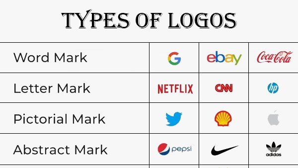
All logos can be divided into 4 categories:

- Word mark. This type of logo consists of a stand-alone word consisting of several letters. For example, you will definitely recognize this one: Google.
- Single letter. This type of logo is also well known to you. This logo is often used when the company name is long or it is difficult to find an association: Honda.
- Symbol image. These are thumbnails of famous things. For example, the Twitter logo.
- Abstract. Usually, it’s hard to tell what’s inside. For example, Nike.
What type of logo is best suited for my company?
Unfortunately, there is no formula for a logo that works equally well for everyone. What’s right for you really depends on your company name and what you’re going to do.
For example, if you have a short name like Visa, a word logo will work well for you. A logo like this helps people remember your name better and faster. If you choose an abstract symbol, it should be something that reflects your brand’s style and personality.
What key points of my business should my logo reflect?
Your logo, color and shape should give customers a clear understanding of what you do.
When people see it, they must feel the personality, the brand personality. They have to understand that you are different from your competitors, you are a professional and do everything at a high level.
For example, the Amazon logo. Their logo is the company name with an arrow at the bottom. The arrows are considered by people to be a smile and reflect friendly customer service. It connects the letters A and Z, indicating that Amazon has everything from A to Z.
Which color to choose?
Choosing a color for a logo is very important. To stand out from your competitors, use colors they don’t use. And remember how color affects psychological factors.
For example, red for Red bull is a great choice. It is associated with activity, action, less aggression and anxiety.
Yellow means cheerfulness, activity, well-being. Blue means trust, serenity and reliability.
What fonts are used?
Fonts, like colors, convey different emotions. For example, law firms must be reliable, strong, fair. The logo should reflect that. So it is better to choose a simple and calm font. And for a candy store, you can opt for an elaborate and cheerful style.
Can I draw a logo or is it better to hire a designer?
Even if you are an artist or have a small budget, it is better to turn to a professional. Experienced graphic designers know what a great logo is and how to create one.
But you yourself need to understand what you want. So before meeting with the designer, think about what colors, fonts, styles you would like to see. And discuss it during the meeting.
What mistakes should you avoid?
The worst mistake is copying a competitor’s logo. All of their customer experiences, good and bad, related to their competitors will be transferred to you by the prospect.
Another mistake could be seeing your logo only on paper. You have to serve it on different ingredients and in different places. For example, how would it look on your website? Or on the street in the form of a billboard? How about putting it on a T-shirt or cup?
How will my logo look in 10 years?
It might be wrong to ask this question in the first place. But you need to understand that over time you will have to redesign your logo. The key here is to do it little by little, discreetly. To do this, you need to understand what you want to see in the final.
Check your logo
Now you understand what your logo will look like. But that’s not all. All successful logos have common features. Check to see if your logo has it:
- Simplicity. The simpler it is, the better it is remembered;
- Overall message. Your logo should reflect what your company does;
- Memory. Your logo should help your customers remember you;
- Association. Your logo should only evoke pleasant associations;
Can be tested. Don’t trust your intuition when designing a logo. Research your niche, consult a designer. This will help you choose the right option. After that, test which option performs better.
Conclusion
Now you understand how to create a logo that works and will benefit you. Take a piece of paper, answer these questions now and tomorrow you will create your successful logo , alone or with professional help, and your business will thrive!


